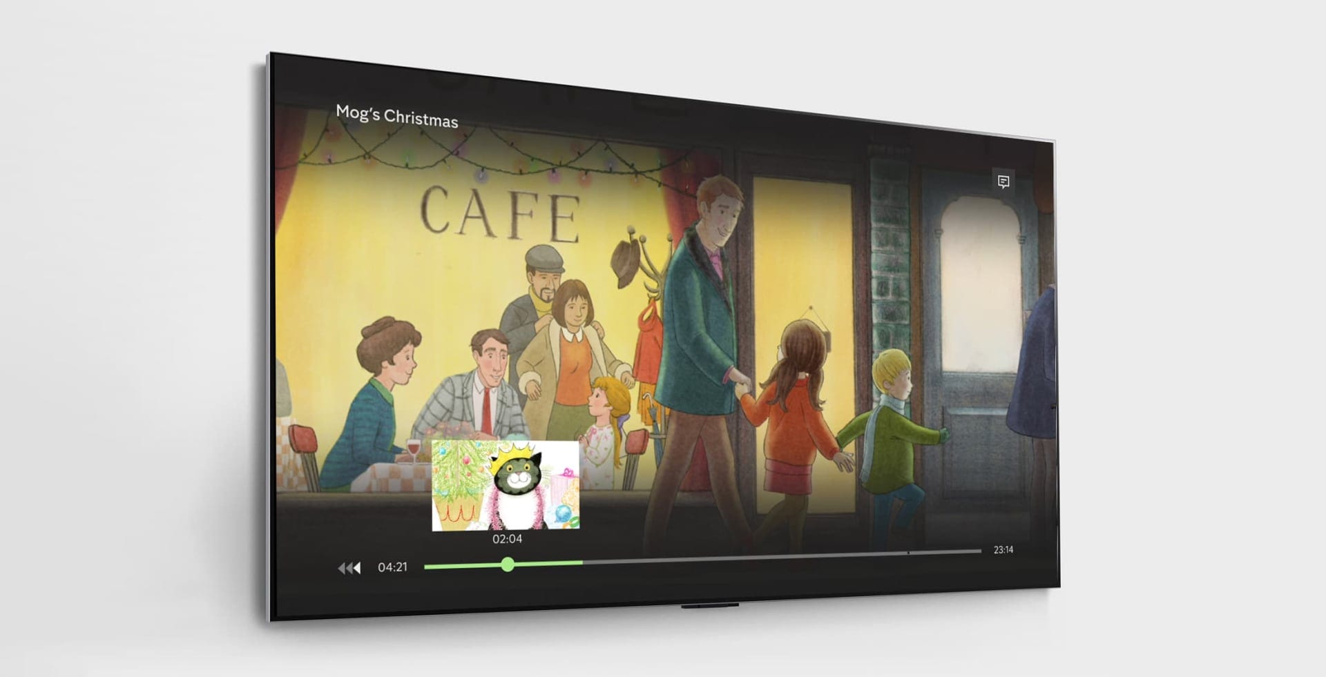
Visual Scrubbing

The Altogether Different streaming service

Brief

I worked with Channel4 throughout various projects, bringing my TV experience to their design team as an external contractor.

I was able to bring an outside perspective to the problems of the business whilst working with the internal design teams as well as a third-party technology supplier.

One brief I worked on in my time there was the introduction of the Visual Scrubbing feature.

Client

Channel 4

Project Date

2023

Role

Senior UX/UI Designer (contractor)

Visual Scrubbing

Channel 4 app was limited in its ability to rewind and fast forward, with customer feedback saying this was especially noticeable when the user was dropped into the incorrect placement of an episode on the continue watching area.

We wanted to create an easy way for users to be able to find the position in playback that they wanted to achieve. We took a lot of time to inspect how other companies in the industry were providing this ability to their users. We noticed a consistent pattern in other apps, but no real industry standards

We knew we wanted to create a visual style that would fit in with the current on-screen designs that users have been exposed to over the last few years. We didn't want this feature to feel too different to the experience so we approached the design elements with a clear userbase in mind.

Mogs Christmas in a TV showing the rewind feature

The Design Process

There were a few different concepts we had been looking at for these conceptual pieces. By looking at competitors in research we narrowed down our thought process to three different interaction patterns and put them in front of users.

5 Tile Version

The first concept brought 5 tiles to the user as they were interacting with the scrubbing element of the screen. We had a lot of positive feedback but also came to a few issues concerning where the focus sat on the screen in relation to playback. It felt that a central navigation fought with the playback area when a user wasn't in the rough middle of the programme. If they were at the beginning or end of the show the expectation was a tile around the area of the progress in the show.

Channel 4 Visual scrubbing wireframe version 2
Channel 4 Visual scrubbing wireframe version 3

Pros

• Users could see more of the show they were watching
• Easier to recognise parts of a show you have already watched
• More tiles made content easier to skim

Cons

• Possible spoilers
• Lots of movement could cause accessibility issues
• Expensive tech resource

3 Tile Version

We also looked at a middle ground of three tiles to reduce the amount of content on the screen from the 5 tiles design but give more context to where the user was in the programme. With more than one tile on screen, we did have to start thinking about moments that could spoil a show for a user. Maybe a contestant was voted off the show before they had got there and they saw on a tile

WWE Superstars screen in phone
Channel 4 Visual scrubbing wireframe version 13

Pros

• Balanced approach between too much and too little

Cons

• Possible spoilers
• The center of the screen is not where the users' eyes are focused
• Expensive tech resource

1 Tile Version

This led to using a one-tile design which would follow the user playhead throughout the programme. This could be invoked at the precise area the user was currently looking at when they decided they wanted to either rewind or fast forward. .

WWE Superstars screen in phone
Channel 4 Visual scrubbing wireframe version 8

Pros

• Easier for the tech teams to create
• No risk of spoilers
• Can be used as a focal area

Cons

• Not as much to work out where in the show you were
• Movement across the screen
• Not as obvious to the user

Further Explorations

As we were testing these different versions of the feature, we were also starting to wireframe different variants of the three concepts.

We used this time to fully explore how the visual scrubbing tiles would look, taking time to think about placement on screen, movement opacity and position. We had some discussions about where a user would naturally be looking whilst controlling their programmes and how the visual scrubbing tiles should be placed in conjunction with the playback bar.

Channel 4 Visual scrubbing wireframe version 9
Channel 4 Visual scrubbing wireframe version 10
Channel 4 Visual scrubbing wireframe version 11

One concern that was aired was the separation between the tile in focus and the playhead on the progress bar which could be at the far end of the screen and disconnected.

Final Designs

After exploring these different designs we settled on the 1 tile approach for the final design. Taking the pros and cons of the different designs and the result of prototyping, the one-tile version testing the best for usability for the end user.

Once we had the final concept locked down, it was time to start looking at the design holistically, starting to ask ourselves how it would fit in with the current user experience and whether it would run alongside existing features that users have become acclimated to in a TV market.

We broke the design down into smaller elements, spending time adjusting and tweaking the layout until we got to the very final design.

Motion Design

It was also here that I started to add the final animation and motion design to hand over to developers. I knew this would be the final touch to a successful feature launch. I had been creating Motion design throughout the whole conception phase so it was an easy step into the final production motion.

Product Scenarios and Edge Cases

Once we had approval for the one-tile approach I started working closer with the developmental and product team to flesh out certain scenarios as well as some more obscure edge cases

Advert Breaks

Advert breaks were a big element of the design in visual scrubbing. Certain questions were raised around feedback for the user when crossing advertisement breaks. Would the scrubbing stop to play the advert? How would the user know an advert break was going to be invoked after playback is started?

visual scrubbing user flow

Back Journeys

Back journeys are an often overlooked element of the user journey so we ensured we spent a lot of time to focus on how a user would be able to navigate throughout the journey.

End of Playback

Channel 4 has a feature which will allow the user to watch the next episode without any interaction needed. This feature became something we had to think about concerning visual scrubbing as suddenly we had an interaction design clash. We had to explore user expectations when they had scrubbed to the end of a show, or also the opposite of the end user had used the rewind function to go back to the start of content. What would be the expected behaviour and how would our interaction model relate to this?

Desiging for Roku

Although we had our preferred design on the product, Roku had a version of visual scrubbing built into the product already. .

This led to discussions about how we would proceed on Roku. was the right approach to keep consistency with the rest of the designs on TV platforms, or to create less friction to release to the public. After some high-level consultation, it was decided to make the development team life easier by using the built-in features. .

This reduced resources needed as well as allowing roku users to have a familiar pattern that they would have used on different platforms on their device.

By using existing Roku patterns, we could create an experience which existing users of the platform would be familiar with, whilst ensuring it matched the ethos of the design on HTML5 platforms

Learnings

Positive user feedback accompanied the release, with customers happy that the platform has a fundamental feature with improved UX and UI. No users across the platforms noted any issues with the feature and Roku users were delighted that we followed the platform guidelines rather than using the same designs across all Channel 4 apps.

Some personal learning was for me in the design process trying to narrow down the different concepts. Being able to articulate design decisions to non-designer stakeholders and backing my opinions with data and facts.

As always including the developmental team early gave us a wonderful opportunity to tweak work on the fly, especially the speed of content rewinding and fast-forwarding with each press of the remote control. With the developers building an easy customisable attribute we could test different speeds instantly.

The benefit of always getting builds sent to a TV device was obvious with this project. Sometimes with Figma and After Effects, we can get too obsessed with the designs and being able to use a remote control in a hands-on testing session can reveal many more conditions that we need to design for.